I heard someone say once…. “Make your blog like a beautiful magazine! Something you want to hold on your lap and turn the pages of for hours and hours!” When I think of a magazine I think of clean straight lines and organized columns! Today I want to share a few tips with you to help keep your blog “all in a line”, like a magazine.
Tip #1. Center all the buttons/widgets in your sidebar.
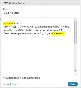
To do this open up each of your html widgets. Add <center> at the beginning of the code and </center> at the end of the code. Here is an example….
[click on image to view larger]
Pretty simple right? And this works whether you have blogger or wordpress!
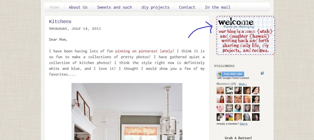
But…. sometimes even when you “center” a gadget [using the html above] it still isn’t exactly in the middle of your sidebar. Anyone have that problem before? Look at the image below….See how the “welcome” note is not in the center of the sidebar. That is because of the “padding” that is built into the blog template. Instead of changing the padding for my sidebar [that can be a little tricky] I think it is easie to move the individual widget. In this case I want my welcome note image to be moved to the left, in the center of my sidebar column. Here is how to fix that….
For Blogger: Go into the Design Tab > Template Designer > Add CSS.
Then you are going to paste this:
#HTML1 {margin-left: -17px;}
You will need to make a few changes to the code above for your specific widget….. First, you need to identify your widgets’ ID – go to Design > Page Elements, and mouse over the specific gadget’s Edit link. The widget Id can be read on the browser’s status bar. Example widgetId=HTML3 will be referred to #HTML3 in the CSS.
You can change the word left to top, bottom, or right, depending on which way you want to move the widget. And of course you can change the number to whatever number you need [positive or negative].
If you want to move you widget in two directions, say up and to the left, you would just add the second command. Like this….
#HTML1 {margin-left: -17px; margin-top: 10px;}
Ta-Da! All centered!
Tip #2. Full Text Justification
Full text justification means that both the left and right sides of the paragraph line up. It is also typical in magazines and personally, I just think it looks “cleaner” for blog text to be fully justified, especially if you have a very long paragraph. It is s i m p l e to justify text.
Simply highlight your text and click the “justify” button. It looks like this… ![]()
This option is avaliable in blogger and wordpress!
Hopefully these two tips will help keep your blog looking clean and organized! Every blog needs a little spring cleaning every once in a while! :) As a side note…. did you join in on the community post yesterday? Go ahead, introduce yourself and and meet a friend or two!
Have a Happy Friday!!!


Helloo!! I came over to visit from SNAP! today and I am in LOVE with your blog!! I am a DIY blog designer (meaning that I do all my own work because I want to learn how so bad!) and your blog is so full of great information. I’m lovin it! This post was especially helpful because I’ve been trying to center my welcome picture for AGES AND AGES and it has been driving me nut-so! I’m also definitely getting the How To move from Blogger to WordPress E-book… that is going to be a LIFESAVER. Awesome stuff here Kendra! I’m in LOVE! :)
perfect! followed link from snap!